Your common pie chart is an example of visually presenting information, anyone can do it, and thankfully, it still looks better than the spreadsheet. But of course we're talking about the lowest levels. On the higher levels of intelligent data visualisations, where you're being highly selective about colours and shapes and the associations people have, it stops being an infographic, and becomes .. almost a book, with stories to tell.
Enter Moritz Stefaner, who holds a B.Sc. in Cognitive Science and an M.A. in Interface Design. Right.
Notabilia:
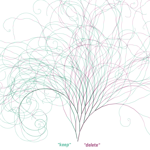
I have to point out this is example number 1, i did not select this topic:

But you get the idea, a thread runs along with users arguing for deleting or keeping as a Wiki page. Clearly "Unusual sex acts" was dropped, but the single thread shows perfectly how the discussion went, arguments from keep, to delete, to keep, but clearly bending towards deletion.
Now this next graphic is what excited me, to quite a silly degree in fact.

Commissioned for Citibank *spit* the whole interactive bit is unfortunately not available, only screenshots. But my oh my, what an interesting story it tells. Who, how much, where to, and from, all with a single glance.
I'm not going to talk about the content, but if only all information was this easy to grasp.
http://moritz.stefaner.eu/





No comments:
Post a Comment